Illustration
Before Any of This Was a Job
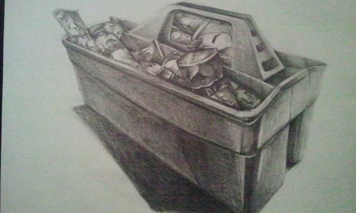
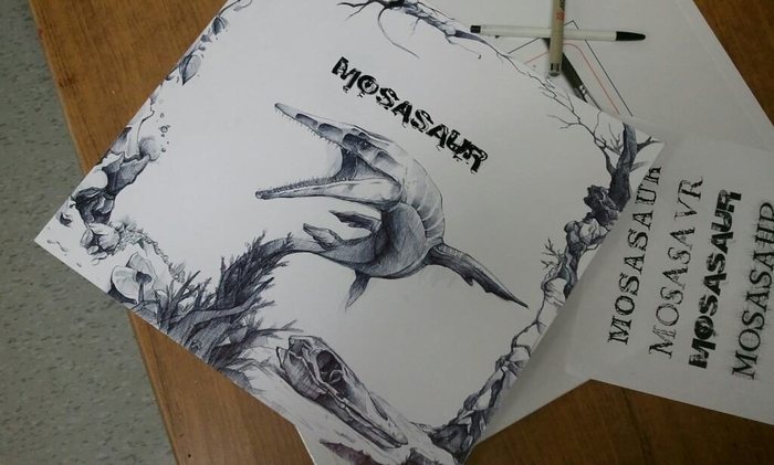
I wanted to be a children's book illustrator. High school art class was pencil, watercolour, and a Monami pen, and the pen drawing below is still the thing I'm proudest of making with my hands. One pencil piece ran in the Hamilton Spectator before I ever touched a computer for design.
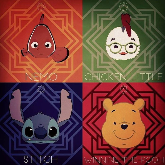
A few years later, in design school, most of what I made was practice: redrawing characters I didn't own, in a style I was still building. It's fan art, not original work, but it's where the character-drawing instinct that later shaped ARND and De Mello actually came from.
ARND: Drawing the Three Audiences Before Building Their Screens
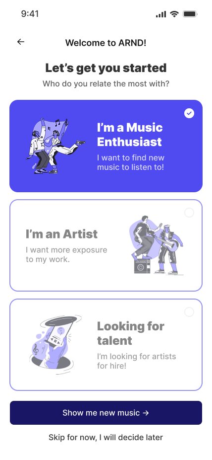
Before I wireframed ARND's onboarding, I drew the three people the app actually serves: a fan who wants to find a show tonight, an artist who wants to be found, and a venue or talent scout looking for who to book. Drawing them as characters first, instead of describing each one in a paragraph, is what made the onboarding this simple: pick the character that looks like you, get a path built for that person.
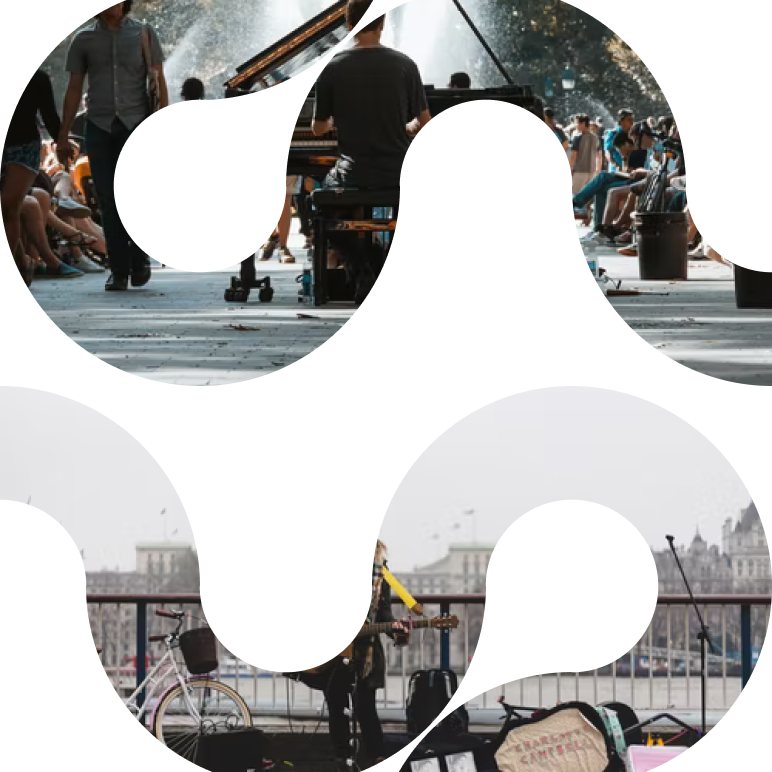
The same instinct shaped how ARND looks outside the app. Street performance photography is the whole marketing story, buskers, pop-up sets, a folding chair and a guitar case, and a straight rectangular crop makes all of it look like stock photography. So I drew a repeating organic shape, tested at a few scales, and used it to crop and frame the real photos instead.
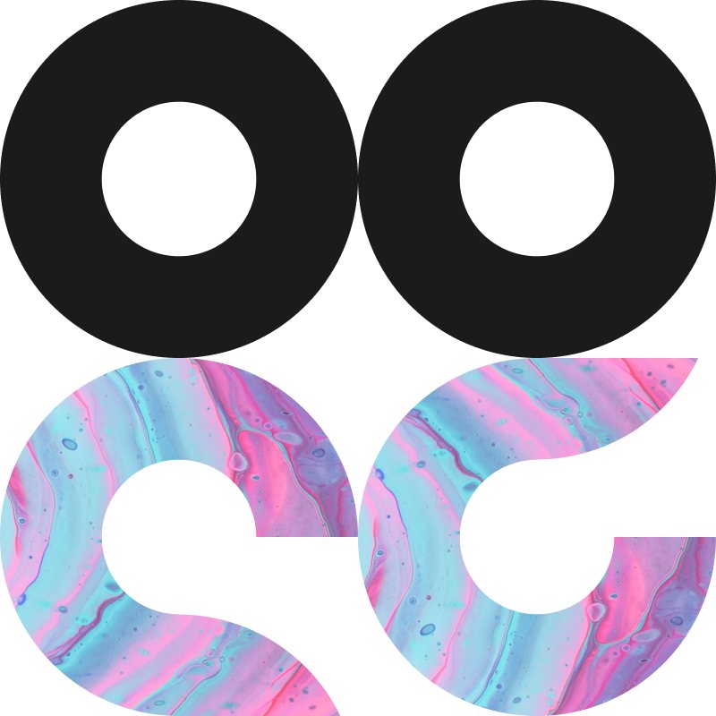
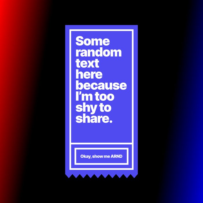
Not every drawing here is a finished asset. This one is a share-card shape I was testing for a moment in the app where there's nothing to say yet, a placeholder that admits it's a placeholder instead of a default gray box.
A Personal Zine
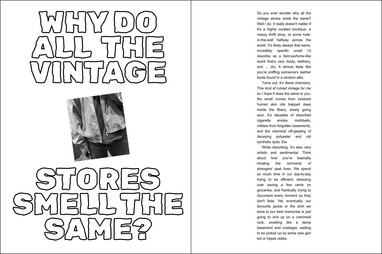
Outside of client and product work, I write and lay out a small personal zine, essays about daily life in Toronto, in Korean, paired with photography and hand lettering. There's no product metric attached to this one. It's where I keep the muscle that doesn't get used in a Figma file: drawing type by hand until it says something a typeface can't.
A Hundred Days of Small Drawings
I did Dribbble's 100-day UI challenge twice, in 2018 and in 2020. Most of it was interface practice, buttons, type pairings, layout rhythm. But the days that held up were the ones with a small illustrated moment in them: an icon that's a joke instead of a glyph.

The full 200 days are at dribbble.com/mooque_ and in the case study. A later, more finished set lives in a Figma file I'm glad to walk through directly, since the prototype link sits behind a login.
De Mello: One Character, Every Room It Has to Work In
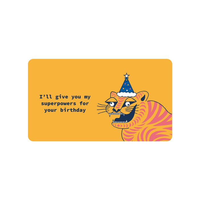
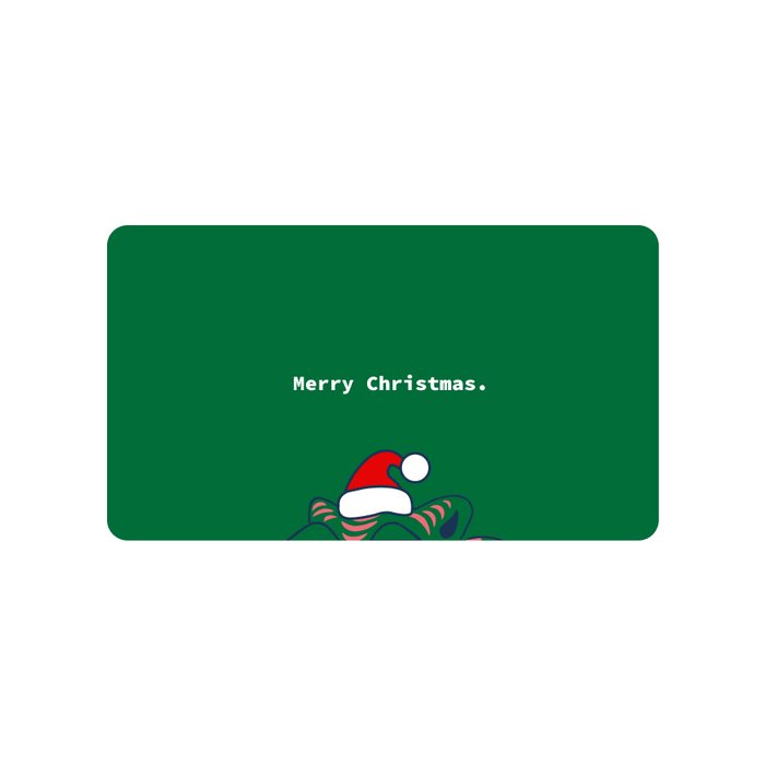
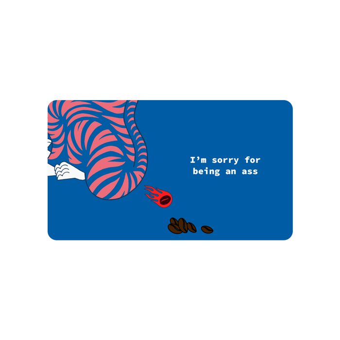
De Mello makes the case clearest. The rebrand's anchor is a single line-drawn tiger, and the hard design problem was never drawing it once. It was making one character do a brand's entire job: hero illustration, product packaging, social templates, and the small transactional moments a coffee roaster actually sends, a birthday note, a holiday card, an apology.
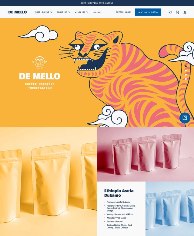

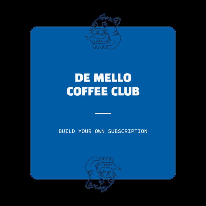
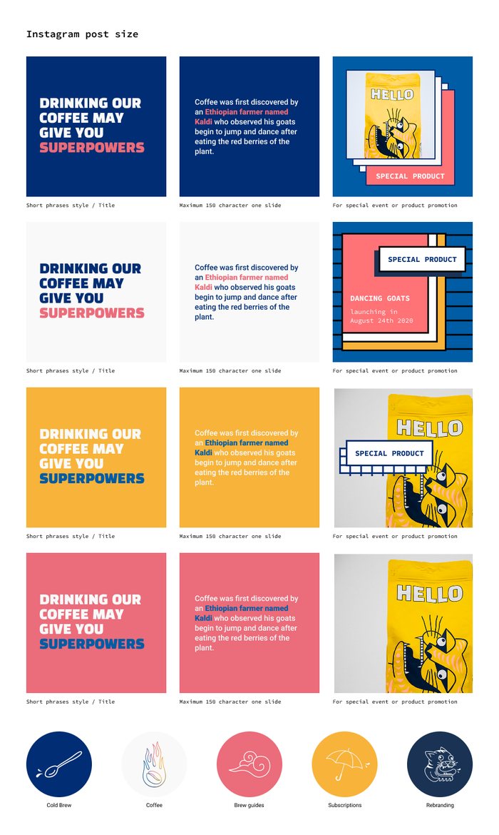
The social content system reused the same character as the entry point for an origin story about the brand, not just a logo watermark.
The gift cards are where the range shows up clearest. Same tiger, three completely different jobs: celebratory, sentimental, and self-aware enough to be funny about a mistake.